Shohei's New New Balance Logo & Famous Athlete Logos
Key Takeaways
- New Balance released a logo of baseball legend Shohei Ohtani
- This logo fails to represent the iconic sports player that he is
- Many fans are left disappointed by this collaboration
The All-Star, Shohei Ohtani
It's a huge honor for athletes to sign a deal with big brands like Nike, Adidas, and New Balance to create their own athletic line featuring their logo. Getting your own logo basically solidifies that you have made it in your field.
Shohei Ohtani's unveiling of his own personal logo marked this significant milestone in his career, solidifying his status as a true all-star in baseball. This momentous occasion came on the heels of his record-breaking 10-year, $700 million deal with the Los Angeles Dodgers, showcasing not only his incredible talent on the field but also his marketability off the field. For reference, the second highest contract is $426 million for 12 years.
As of today, Shohei Ohtani has won a home run derby and has two American league MVP awards. Not only that, but he is the first full time two way player in nearly a century. This talent shows on the field- like when he hit two home runs and struck out 10 batters in 2023 all in the same night.
The Not-So-Great Logo
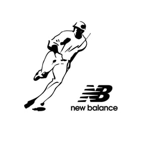
Teaming up with New Balance, his iconic design will not only be a symbol of his success but will also be prominently featured in a range of projects and collaborations throughout the upcoming 2024 season, further solidifying Ohtani's place among the elite athletes of our time. However, this logo failed to be a true representation of how talented he is in the world of baseball. The logo missed the mark in capturing the essence of Ohtani's unique skill set and accomplishments on the field. It lacked the dynamic energy and power that Ohtani exudes in every game, from his explosive home runs to his dominant pitching performances. A missed opportunity to truly showcase the multifaceted talent of this baseball superstar.
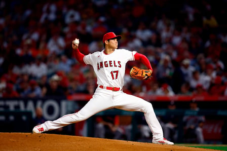
This logo fails to represent everything that Shohei Ohtani does within the MLB; he is not known as a runner- in fact, Ohtani has 171 homers in his entire career so far- only beginning in 2018. This logo had so much potential for everything Shohei Ohtani does on the field- like his unique power stance, his Griffey-esque follow through, and even his distinct pitching delivery.
Famous Athletic Logos
When designing a logo, it's crucial for it to effectively communicate the overall branding and essence of the athlete it represents. In the case of Shohei Ohtani, his logo missed the mark in capturing the full scope of his talent and achievements on the baseball field. However, there have been numerous examples of famous sports players who have had personally designed logos that perfectly encapsulate their brand and unique skills. These logos not only serve as a symbol of their success but also as a visual representation of their exceptional abilities and impact in their respective sports. From Michael Jordan's iconic Jumpman logo to Cristiano Ronaldo's CR7 emblem, these logos have become synonymous with greatness and have effectively communicated the essence of these legendary athletes to their fans and the wider world. A well-designed logo has the power to elevate an athlete's personal brand and create a lasting legacy that resonates with fans for years to come.
Michael Jordan
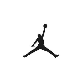
Like Ohtani's Jordan's logo (also known as 'Jumpman') is simple in black and white- however, unlike Ohtani's, the pose is so recognizably Jordan's. Nike clearly designed this logo with Michael Jordan in mind. In fact, this logo is an exact tracing of Jordan making a jump shot during a game.
Tiger Woods

The Tiger Woods logo, created by Nike, is also a clean, black and white logo that embodies the essence of the legendary golfer. The logo features a sleek T and W to represent his name, which is obvious, but sleek and well designed. New Balance could have went this route with Ohtani, like having an 'SO' logo, which we think would've been more representative of the legendary baseball player than a running pose.
Tom Brady
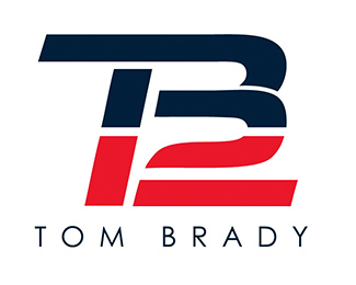
Tom Brady's logo is also very well-done and representative of his star quality. Similar to Tiger Woods logo, it features his initials, but also includes his football number- 12. The logo is also done in his (at the time), team's colors- making it easier to recognize who the logo is. New Balance could've done this with Ohtani, showcasing his initials, alongside his current team's colors and his number- red, white, and 17.
Fans Speak out
This logo was a big miss- so we made a video on Instagram voicing our frustration about New Balance's failure to represent the big star through his logo.
Throughout the comments, we found that many fans agreed with our take, stating, "Yucky. Definitely better options for a silhouette. I'd prefer something that screams "GET OFF ME BALL!" , "Using the runners Silhouette is not iconic. Agree with your take. His stance or finish would look great." and "Big miss for a big star"
We agree- this logo just doesn't live up to the champion and legend that Ohtani is.
New Balance's Mistake
New Balance's misstep with Shohei Ohtani's logo design has sparked disappointment among his devoted fan base. Crafting a logo for a player of Ohtani's caliber demands a deep understanding of his unique skill set and persona. It is essential to encapsulate his essence accurately to resonate with fans and showcase his exceptional abilities. While New Balance's attempt fell short in capturing Ohtani's true essence, there were alternative approaches that could have better reflected his prowess on the baseball field.
Exploring the logos of other sports icons provides a valuable lesson in effective branding. By drawing inspiration from successful athlete logos like Michael Jordan's Jumpman, Tiger Woods' sleek emblem, and Tom Brady's personalized design, New Balance could have crafted a more representative logo for Ohtani. Incorporating elements such as his powerful pitching stance or a stylized interpretation of his initials could have better conveyed Ohtani's impact and legacy in the world of baseball.
The disappointment expressed by passionate fans on social media underscores the missed opportunity in New Balance's logo design for Ohtani. The running pose chosen for the logo failed to capture the essence of Ohtani's remarkable talent and achievements on the field. A more thoughtful and strategic approach to logo design could have elevated Ohtani's personal brand and solidified his status as a baseball superstar. In the competitive world of athlete branding, attention to detail and a deep understanding of the athlete's persona are crucial in creating a logo that truly resonates with fans and encapsulates the athlete's unique qualities.

