Why Jaguar’s Rebrand Misses the Mark (and Other Rebranding Misfires)
Introduction: Rebranding Gone Wrong
Rebranding can be a powerful way for companies to reinvent themselves, attract a new audience, and stay relevant. But what happens when a rebrand alienates your loyal customers and sparks ridicule online? Enter Jaguar’s new logo—a minimalist take that replaces its iconic leaping cat with a generic font that screams “startup template.”
In this blog, we’ll break down why Jaguar’s rebrand is already being labeled a failure and explore other infamous rebranding disasters that left audiences scratching their heads.

The Jaguar Rebrand: Losing Its Identity
For decades, Jaguar’s leaping cat logo has been synonymous with luxury, speed, and elegance. It embodied the very essence of the brand. The new design, however, strips away that personality, leaving behind a wordmark that’s… just a wordmark.
Why it doesn’t work:
- Loss of Emotional Connection: The iconic leaping cat conveyed power and motion, two qualities Jaguar is known for. The new logo feels static and lifeless.
- Generic Minimalism: Minimalist design is trendy, but this execution lacks any distinctive flair. It looks more like a tech startup logo than a luxury car brand.
- Online Backlash: A quick scroll through social media reveals memes, sarcastic comments, and an overall lack of excitement from Jaguar enthusiasts.

Other Rebrand Failures That Shocked the World
Jaguar isn’t alone in the hall of rebranding shame. Let’s look at a few other companies that attempted to reinvent themselves, only to face massive backlash.
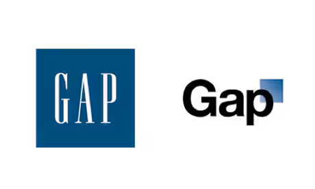
1. Gap (2010)

- What happened? Gap replaced its timeless blue box logo with a plain, Helvetica font and a tiny gradient square. It was meant to signal a modernized approach but was met with universal criticism for looking amateur.
- Outcome: After only six days of relentless public backlash, Gap reverted to the old logo.
2. Tropicana (2009)

- What happened? Tropicana redesigned its iconic orange-with-a-straw logo into a flat, minimalist look. Consumers were confused and felt the new packaging lacked the familiar warmth of the original.
- Outcome: Tropicana lost over $20 million in sales within weeks and reverted to the old design.
3. Pepsi (2008)

- What happened? Pepsi spent $1 million redesigning its logo into what many saw as a “weird smile.” Critics said it resembled a knock-off of their own iconic branding.
- Outcome: While Pepsi stuck with it, the redesign was mocked for years and still sparks debates online.
4. Yahoo! (2013)

- What happened? Yahoo! revealed a new logo after a month-long “logo-a-day” campaign. The result? A bland redesign that felt uninspired and failed to capture the brand’s quirky, fun personality.
- Outcome: The new logo wasn’t disastrous, but it certainly didn’t generate the buzz Yahoo! hoped for.
Why Brands Should Think Twice Before Rebranding
Rebrands are risky. While they can breathe new life into a brand, they can also alienate loyal customers and make the brand unrecognizable. Companies should consider the following before making a big change:
- Understand Your Audience: What do your customers love about your current branding? Don’t lose what makes your brand unique.
- Test the Waters: Conduct focus groups or surveys to gauge public perception before launching.
- Keep It Cohesive: A rebrand shouldn’t stray so far from the original identity that it feels disconnected.
Conclusion: Jaguar’s Leap Into Minimalism
Jaguar’s new logo may be sleek, but it’s clear from the public backlash that it’s missing the mark. By abandoning its iconic imagery, the brand risks losing its emotional connection with consumers. While it’s too soon to tell if Jaguar will backpedal like Gap or Tropicana, one thing is certain: rebranding isn’t just about a new look—it’s about preserving the heart of what makes a brand special.

What do you think of Jaguar’s rebrand?
Share your thoughts in the comments below, and let us know which rebranding failure shocked you the most.


